BLOGS
Developers Guide to Dark Mode Email Design
We discuss steps for developers to create and improve email templates for dark mode in their notification service.
Dark-mode media has quickly become a popular preference for UI, with light-mode still being commonplace. This split in preferences is convenient for users, but inconvenient for developers and designers, who need to consider both. We will discuss concepts to consider and methods to update your emails and other notifications to look better in both modes.
Understanding Dark Mode
To change our approach to email design, we need to understand how providers, Desktop, Android, and iOS alter emails to fit into their dark modes. Each provider handles their dark mode differently, however, their approaches can be categorized into 3 groups:
Minimal Dark Mode
These dark modes only affect the provider/application and won’t change your email or its contents. This form of dark mode won’t ruin your email designs, but it won’t do you any favors either. Dark mode is often used at night or to reduce eye strain, and light templates will look especially jarring within these applications.
Partial Color Inversion
These dark modes will convert the colors of text and background to match the color scheme of their dark mode. Dark modes that employ this approach offer the most compromise for developers and designers, but this doesn’t solve all our issues.
Full-Color Inversion
These dark modes will invert the colors of text, background, and even images. This approach causes the most invasive changes and may break parts of your design with the potential to invert the colors of your pictures.
Popular Providers
Your time updating templates and designs for dark mode is best spent tackling the methods used by the most popular providers. We’ll address four of the most commonly used email providers, though your mailing list may include some not covered in this list.
The types of dark modes used by each provider vary depending on whether their service is used on desktop, iOS, or Android. This means there is no one-size-fits-all for designing emails for any given provider, and you will have to adopt new practices to guarantee your templates look good under each circumstance.
Here is a brief table noting how each provider uses dark mode on different devices:
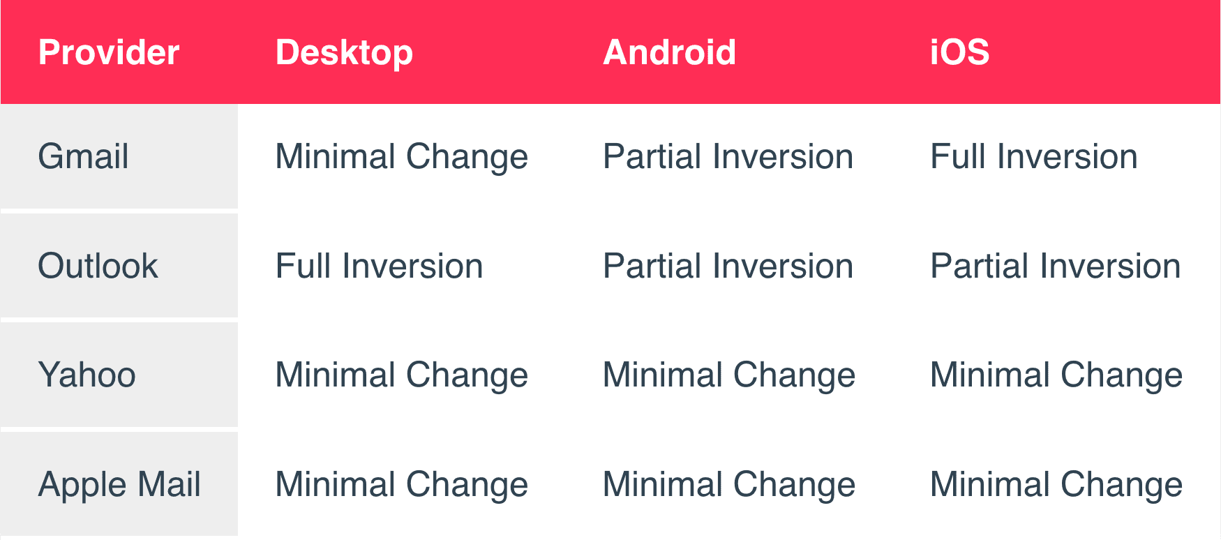
Over time, providers may change their approach to dark mode. It’s best to prepare your emails for all kinds of dark modes, so you don’t need to address your templates each time providers update.
Gmail
Between Desktop, Android, and iOS, Gmail employs different dark mode behaviors across the three. This means more work catering to emails for all categories of dark modes, but best practices should also lead to improvements in email quality for all other providers.
Outlook
Outlook uses full or partial inversion depending on your platform, meaning that your light emails will be changed to some extent in all Outlook inboxes.
Yahoo & Apple Mail
Both providers feature dark modes that only affect the color scheme of their application, and do not affect your email’s appearance on any platform.
Best Practices
Now that we’ve defined how each provider’s dark modes operate and differ depending on a user’s system, we can discuss solutions for each.
Color Schemes
When creating a color scheme for your dark themes, avoid using pure black and white. These colors create harsh contrasts that will negatively impact your email’s readability. Popular solutions when designing dark-mode-friendly color schemes include midnight blues (#002066, #193246, #243048) or darker greys (#424242, #202127, #313338) as background colors. For text, you can use lighter greys (#EDEEF4, #D1D7E8, #D0DED7) since they will appear nearly white, without the intensity and “glow”.
Vibrant colors within dark themes appear more intense and can cause a blurring effect on shapes and lettering. Avoid these colors and employ muted tones when selecting accent colors within dark-mode-friendly designs.
Partial and full inversion dark modes look for dark themes before inversion. This means you can use dark-themed templates as your default, to maximize readability with only 1 color scheme.
Media Queries
Some providers, like Apple Mail, are receptive to HTML and CSS solutions. You can make use of this and prepare styles for dark themes.
Using media queries, you can prepare light and dark color schemes for an email template, and Apple will display the correct theme based on the user’s current theme.
Adjust your Font
Light text on darker backgrounds can cause thinner fonts to lose sharpness to the contrast of the background. Check your fonts on dark backgrounds to see if they should be adjusted to improve readability. If your font loses its edge under these conditions, consider a new font or increase your font’s weight.
Improve your Logos and Images
It’s important that your branding stands out, but also fits in. Any images with a white background should become transparent, as the white background will stand out in emails under partial conversion. If you have a dark logo, ensure it doesn’t get obscured when displayed on darker backgrounds. You can fix this by adding a lighter outline to your logo that blends in on light mode but helps your logo stand out on darker ones.
Test your Templates
The best way to improve your template is to see how it appears in each provider’s inbox. Send test emails to yourself and your coworkers to identify any parts of your template that could use improvement, and employ the suggestions above.
Our Solution
Using our experience developing & distributing media, we at NotificationAPI have created our own dark-mode preview within our multi-channel editor. This feature lets you preview your email templates in dark mode, so you can make sure you deliver notifications that look good in any layout.